AI Use Tracker
Building a native iOS app as a solo designer using Claude Code. From first prompt to a working build on my iPhone in seven hours. Product thinking, UX design, and SwiftUI development by one person.
| role | Solo designer-developer |
| project | Personal project |
| timeline | 7 hours · single sitting |
| platform | iOS · SwiftUI |
| stack | SwiftUI · ActivityKit · WidgetKit · Keychain · Claude Code (Sonnet 4.5) |
| status | built · shelved (ToS constraint) |
import ActivityKit
import WidgetKit
import SwiftUI

// Live Activity drives Lock Screen + Dynamic Island
struct UsageLiveActivity: Widget {
  var body: some WidgetConfiguration {
    ActivityConfiguration(for: UsageAttributes.self) { context in
      LockScreenView(state: context.state)
    } dynamicIsland: { context in
      DynamicIsland {
        // expanded · trailing · countdown pill
        DynamicIslandExpandedRegion(.trailing) {
          CountdownPill(reset: context.state.resetAt)
        }
      } compactTrailing: { Text(context.state.shortLabel) }
        minimal: { Text("%") }
    }
  }
}
From design to code in 7 hours
I designed and built a native iOS app from scratch. No engineering team, no bootcamp, no prior Swift experience.
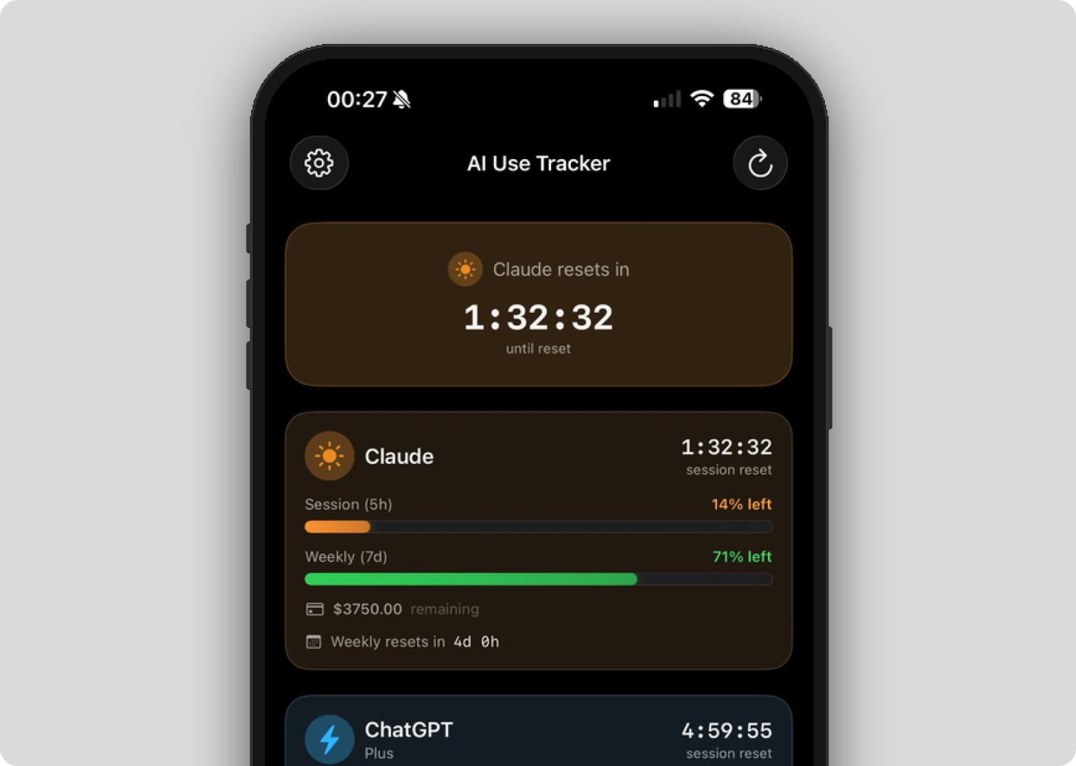
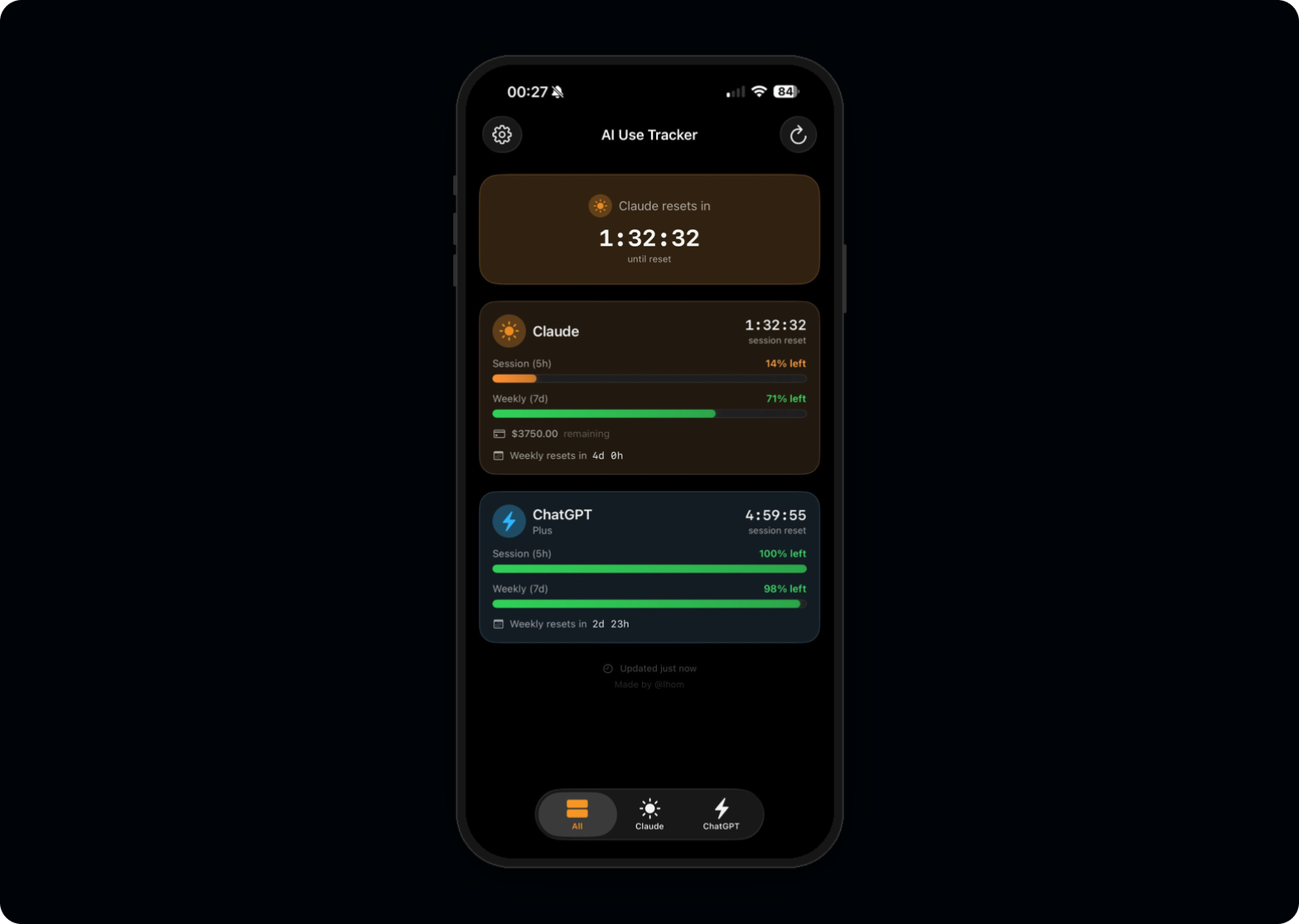
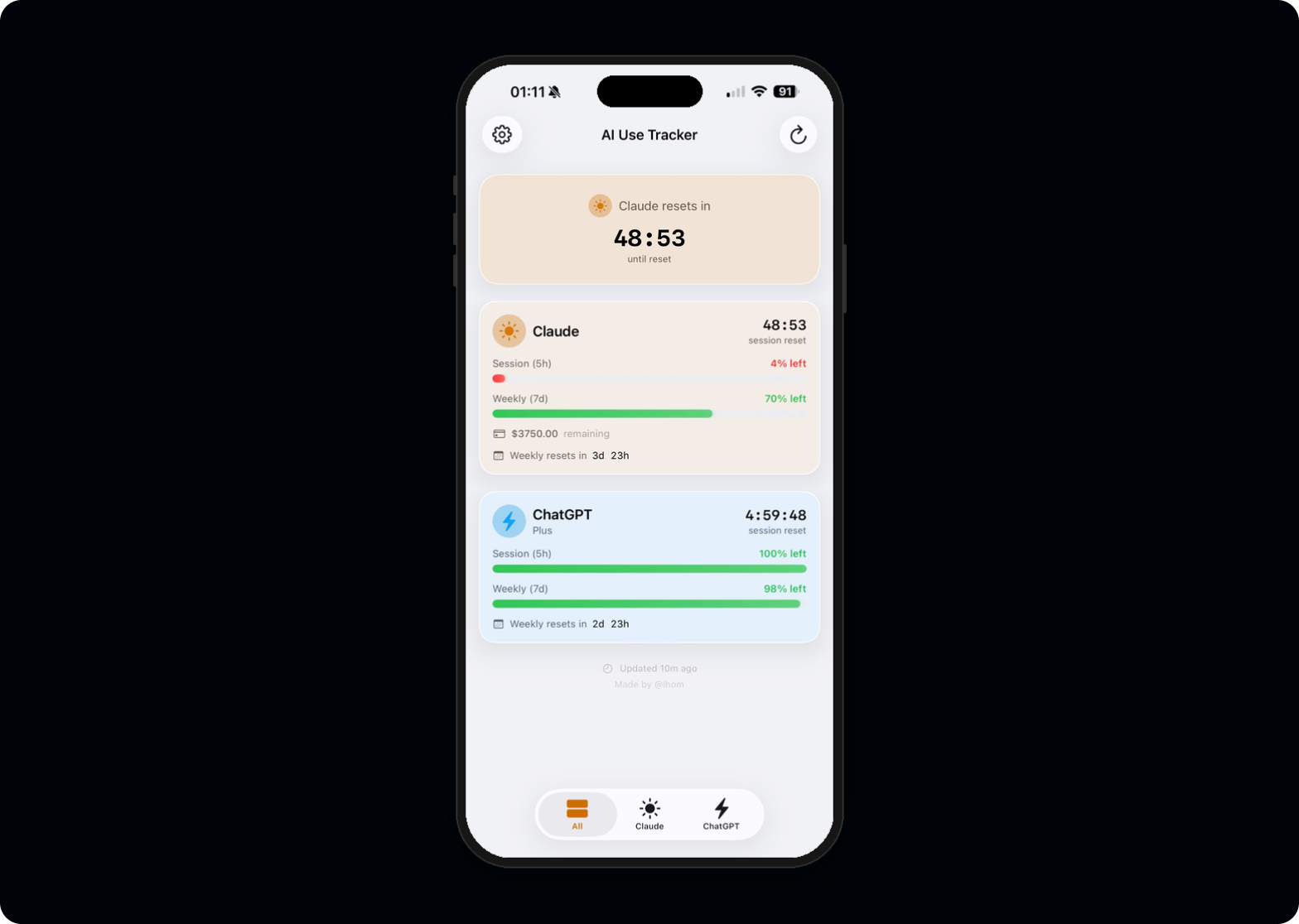
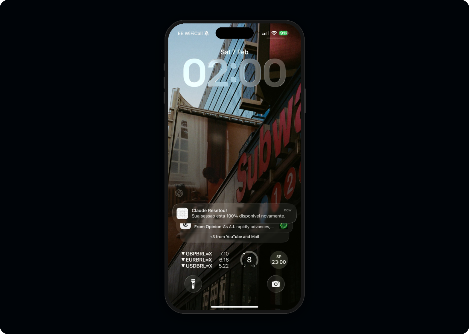
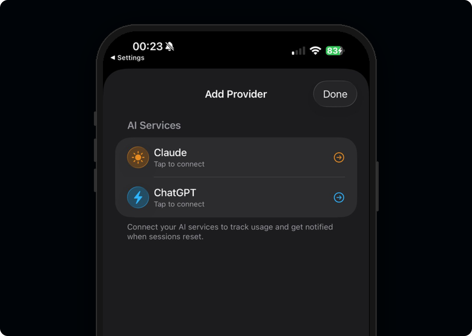
AI Use Tracker monitors token consumption across Claude and ChatGPT with countdown timers, Live Activities, and Dynamic Island integration. The entire project, from first prompt to a working build on my iPhone, took seven hours in a single sitting, using Claude Code as my engineering partner.
Then I discovered I couldn't ship it.
This case study isn't about the app itself. It's about what happens when a designer with a decade of product experience stops waiting for engineering resources, builds the thing, and finds the boundaries that only become visible when you go all the way to the metal.
Solo designer-developer, 7-hour sprint
Every meaningful product decision was mine. Claude Code translated those decisions into Swift.
The invisible limits
Every designer who uses AI tools daily knows the frustration. You're mid-flow, deep in a conversation, and suddenly you hit a usage limit you didn't see coming.
There's no countdown, no warning, no visibility into how close you are to the wall. You're forced to switch context, lose momentum, and wait.
I use Claude and ChatGPT professionally for research, prototyping, copywriting, code generation, and design critique. Across both platforms, usage resets happen on different schedules with different rules, and neither platform surfaces this information in a useful way.
The tools I rely on to work faster were, paradoxically, slowing me down by being opaque about their own limits.
No visibility, no control
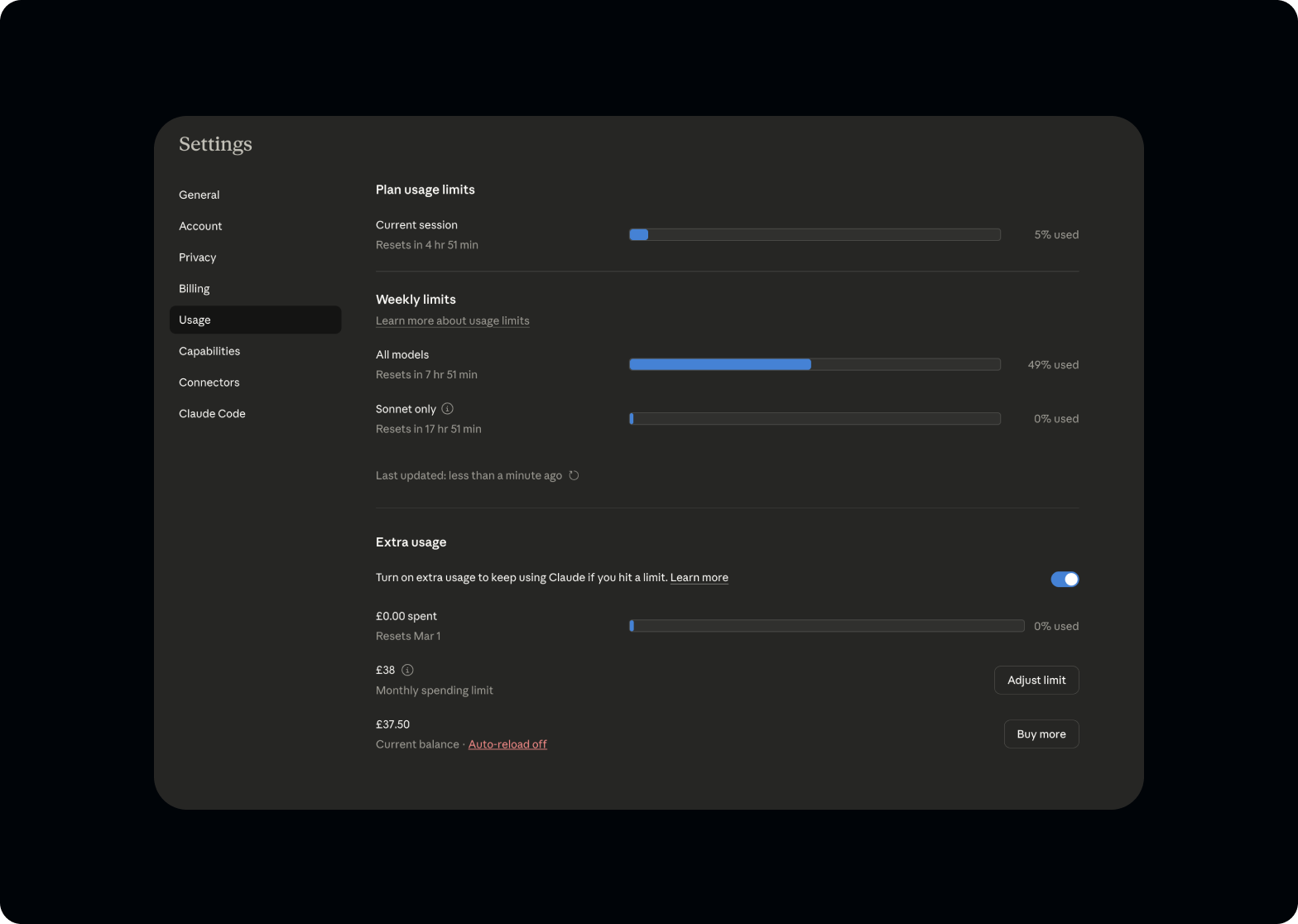
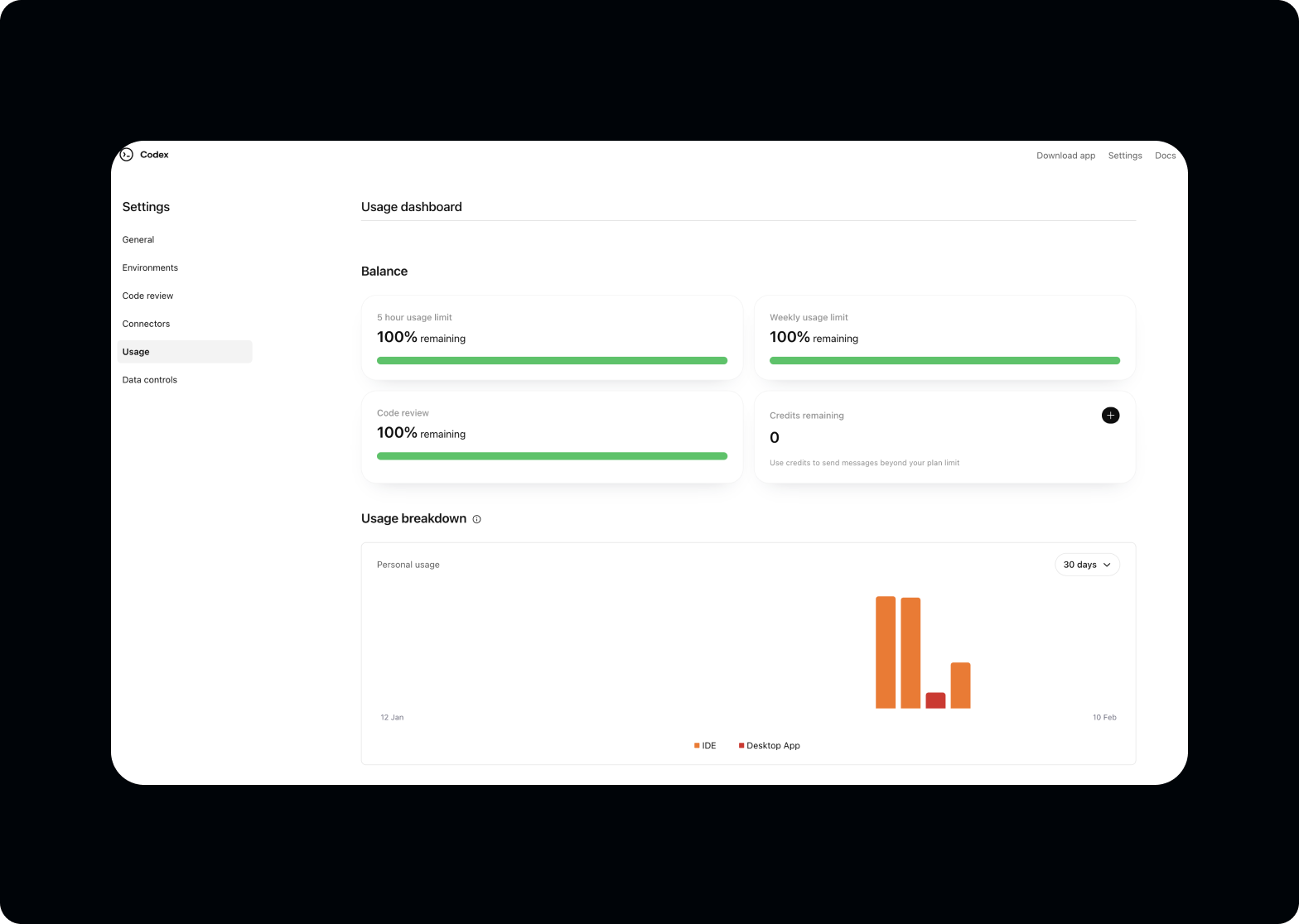
Both Claude and ChatGPT have usage limits for consumer accounts, but neither platform provides the information power users need.
- A real-time view of remaining capacity
- Predictable countdown timers for session and weekly resets
- Glanceable status without opening the app
- Proactive notifications before hitting limits
The information exists. Buried in account dashboards, hidden behind multiple clicks, formatted for billing teams rather than power users. For someone who depends on these tools for six to eight hours daily, this is a workflow gap with real productivity cost.
Why build instead of design
The fastest path to solving the problem. Not a proof of point.
I've spent my career creating Figma files that communicate intent to engineering teams. Prototypes that approximate behaviour. Specs that try to capture every state. But this project didn't have an engineering team to hand off to. It was a personal tool for a personal problem.
The decision to build it myself wasn't about proving a point. It was the fastest path to solving the problem. A Figma prototype wouldn't refresh my usage data. A clickable mockup wouldn't tap me on the wrist through Dynamic Island.
Claude Code changed the calculus. The question stopped being "can I code this?" and became "can I make the right product decisions fast enough?"
Design thinking, engineering execution
Three operating principles for the seven hours. Each is a designer's instinct applied to code.
Start with the interface, not the architecture.
As a designer, I think in screens, states, and transitions, not in class hierarchies. So I started where I start every project: what does the user see?
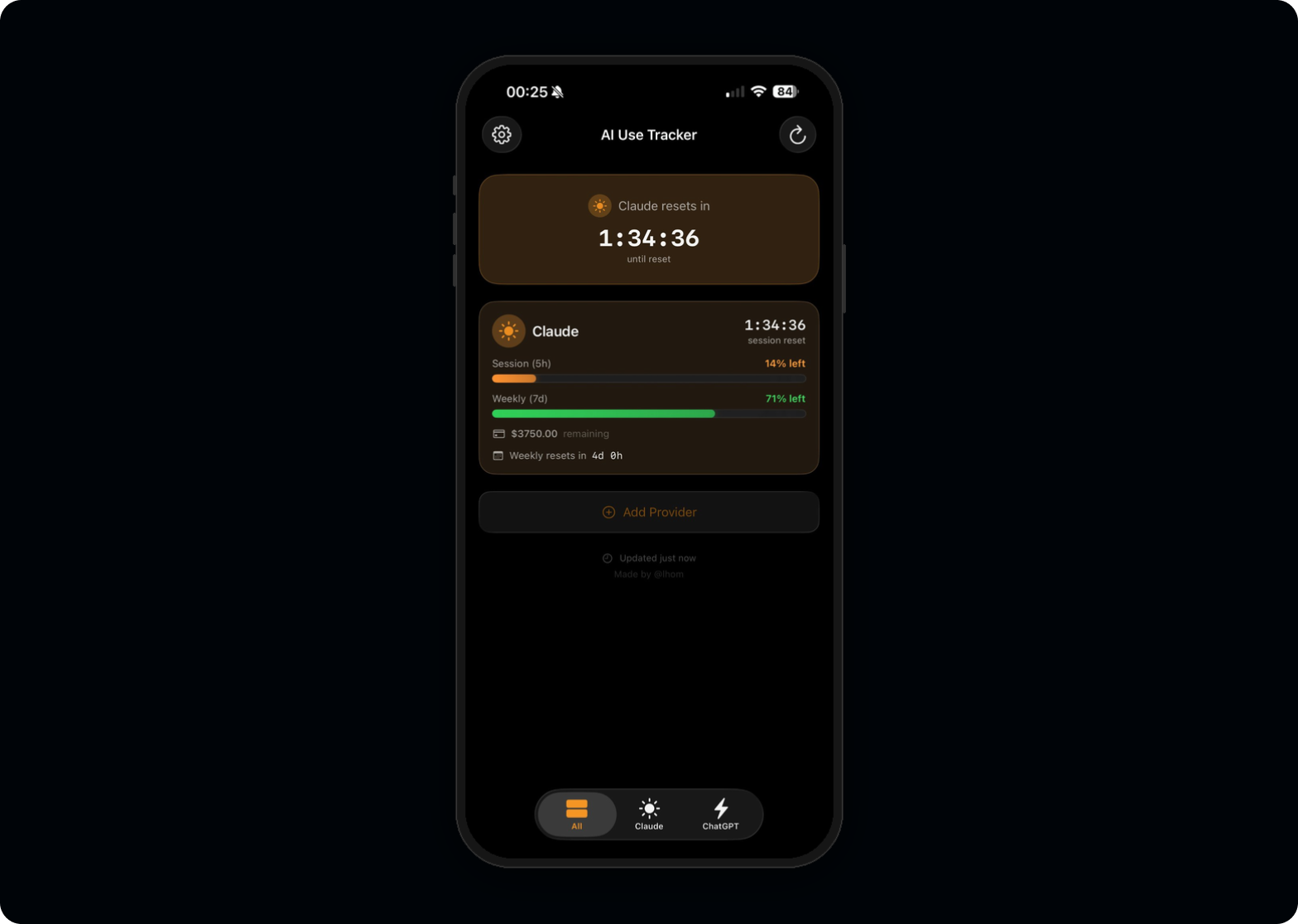
I sketched the core views on paper first. Three tabs (All, Claude, ChatGPT), each showing a countdown timer and a usage bar. The information hierarchy was clear from day one because I've spent ten years making complex data glanceable.
Use AI as a pair programmer, not a code generator.
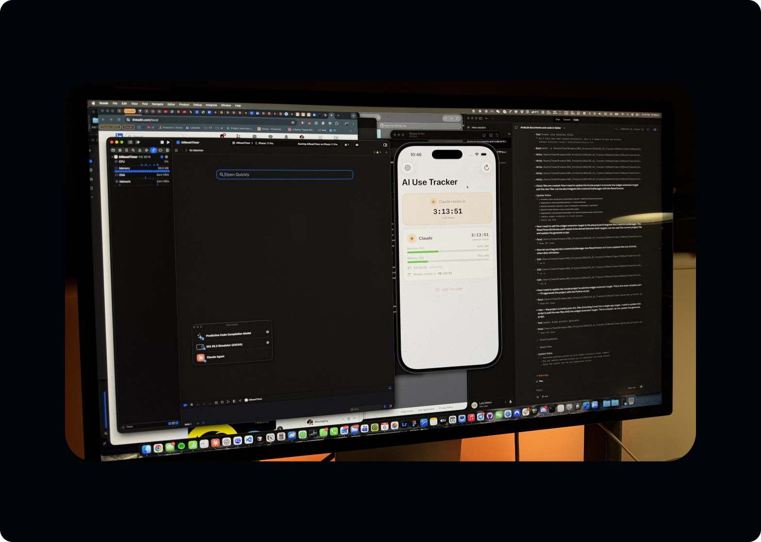
Claude Code didn't write the app. I made every architectural decision: MVVM pattern, Keychain for token storage, ActivityKit for Live Activities, separate framework for shared logic between app and widget. Claude Code translated those decisions into Swift. When it suggested patterns I didn't understand, I asked it to explain. When its suggestions conflicted with my UX requirements, I overruled it.
The dynamic was closer to a senior designer directing a fast junior developer than to "AI building an app."
Design system thinking from the start.
Even for a personal project, I couldn't help myself. Consistent spacing, a deliberate colour system (claudeOrange, chatgptBlue), SF Symbols for iconography, and Liquid Glass effects for iOS 26 with proper fallbacks. The muscle memory from building design systems at Evoke across three brands carried over directly.
Technical decisions are design decisions
The most important feature isn't inside the app. It's outside it.
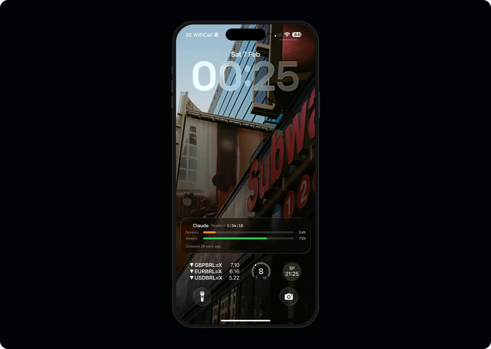
LiveActivityManager, and careful thinking about compact vs. expanded states. The pill toggles between timer and percentage. A tiny interaction detail that only matters when you live with the product daily.
AuthManager that abstracts the complexity from the UI layer. Different backends, consistent frontend.
The build · 7 hours, one sitting
From first prompt to a working build on iPhone. Each phase tracked against the wall clock.
ResetTracker service became the central nervous system. I refactored twice because the first data flow felt wrong. Knowing when something "feels wrong" architecturally is the same instinct as knowing when a layout has bad hierarchy.Then reality hit
I compiled the final build, installed it on my iPhone, and watched the Dynamic Island light up with my Claude usage data for the first time. Then I started the audit.
I compiled the final build, installed it on my iPhone, and watched the Dynamic Island light up with my Claude usage data for the first time. It worked. Seven hours earlier, this app didn't exist, and I'd never written a line of Swift in my life.
Then I started the audit.
But here's the thing: the app not shipping doesn't diminish what happened in those seven hours. It amplifies it.
For the first time in ten years, after hundreds of Figma files handed off to engineering teams, after thousands of design specs translated by someone else into code, after a decade of being one step removed from the thing that actually reaches the user, I built something end to end. From the first sketch to a working build on my own phone. No engineer. No sprint planning. No handoff document. No waiting.
And the discovery that the app couldn't ship? That was itself the kind of finding that only comes from building. A Figma prototype would never have surfaced the ToS constraints. A spec document would never have revealed the authentication complexity. You have to go all the way to the metal to understand where the real boundaries are.
The fact that power users need to reverse-engineer access to their own usage data is itself a design failure from the platforms. There's a clear product opportunity for both Anthropic and OpenAI to expose consumer usage APIs, giving users and developers legitimate access to information that's already theirs. Understanding these platform constraints (regulatory, technical, and legal) is core to my work. At Evoke, I navigated UKGC gambling regulations. At Google, I worked within Gemini's safety guardrails. Knowing where the boundaries are is part of designing responsibly.
What I learned
Design experience transfers directly. Three observations that surprised me.
2d 14h when over 24 hours, but switches to 14:32:07 under 24h. Not a spec item. Something I changed at 11pm because it felt wrong. Those micro-decisions compound into a product that feels considered.
What this means for design
The project is shelved, but the capability isn't.
The project is shelved, but the capability isn't.
What excites me most isn't the app itself. It's what it represents. We're at the beginning of an era where the designer doesn't just draw the interface and hope the implementation matches. The designer sits at the table with the people who build, carrying a decade of knowledge about users, business logic, and systems thinking directly into the engineering process.
A designer who understands authentication flows makes better login screens. A designer who's wrestled with API limitations makes better error states. A designer who's built the data layer makes better dashboards.
The future isn't designers who code replacing engineers. It's designers who can prototype at the level of fidelity that used to require a full team, testing real APIs, real authentication, real device capabilities, and bringing that depth of understanding back into every design decision they make.
Results
Impact, in four lines.
Tools and skills
Stack used end to end during the seven-hour build.